Sprout,budgeting that grows with you.
A budgeting app designed to make managing money feel simple, supportive, and less overwhelming.
Managing money shouldn't feel intimidating — but for new budgeters and people with irregular income, existing finance apps often feel complicated, rigid, or discouraging.
The problem is clear: budgeting apps tend to be complex or judgmental, leaving users overwhelmed and unable to keep track of spending, bills, and goals.
The solution I designed is Sprout, a mobile app centered on fast budget setup, simple bill tracking, clear safe-to-spend summaries, and visual goal progress — all wrapped in a friendly, non-judgmental experience.
Listening before designing
I interviewed six participants and reviewed the competitive landscape to understand what people actually need from a budgeting tool.
I spoke with students, freelancers, and gig workers. Three themes stood out: users wanted a clear answer to "what can I safely spend right now," struggled to keep bills organized, and found most budgeting tools overwhelming rather than helpful.
"Some apps feel like they expect you to already know how to budget—it's overwhelming from the start."
"I want to get better with my money, but it always feels so complicated."
"Just tell me what I can actually spend right now. I don't want to dig through numbers or guess—I need one clear place that shows what's safe to use after bills."
Representative quotes from participant interviews.
A review of YNAB, Goodbudget, and EveryDollar reinforced the opportunity: these tools offered strong financial structure but often felt rigid for beginners — leaving room for Sprout to be simpler and more encouraging by comparison.
“Give every dollar a job.”
Powerful zero-based budgeting with strong educational support, but a steep learning curve and $14.99/month price tag can feel like overkill for casual budgeters.
“Budget with a purpose.”
A simple, manual envelope system, good for shared household budgeting — but no bank syncing means more manual upkeep, and the interface feels dated.
“Tell your money where to go.”
An easy, beginner-friendly zero-based system — but bank syncing and reporting are locked behind the $17.99/month premium tier.
Comparing YNAB, Goodbudget, and EveryDollar's approach to budgeting.
Designing for real budgeters
Two personas kept the design grounded in real users rather than financial experts.
“I need to see everything in one place and fast.”
- Wants to centralize all income sources and track progress on both short- and long-term savings goals
- Loses interest in dashboards that are slow, busy, or offer no visual feedback
- Needs a quick, at-a-glance view of what's left to spend each week — without having to micromanage
“Budgeting makes me anxious — I just want something kind and simple.”
- Wants to build an emergency fund and save for a graduation trip without feeling overwhelmed
- Avoids checking her bank account due to anxiety, and feels shamed by apps that flag her for going over budget
- Needs spending and savings clearly separated, with consistent reminders instead of one-time warnings
Personas synthesized from patterns across all six interviews.
Despite different circumstances, both personas needed the same things: clarity, flexibility, and encouragement. That became the foundation for every design decision.
From insight to interface
Affinity mapping revealed the sharpest insight of the project: users didn't just need more features — they needed less stress.
Money management already felt stressful, and complicated tools made that worse. That pushed the design toward a low-stress experience built around easy bill tracking, clear spending visibility, and visual goals.
I organized patterns from all six interviews into an affinity map — grouping user goals, financial challenges, desired features, and pain points to surface the sharpest insight of the project.
I sketched rough ideas for Sprout's core screens, then refined them into low-fidelity wireframes in Figma — focused on supporting the three key tasks identified in research: onboarding, adding a bill, and creating a savings goal.
I mapped the core flows so onboarding, bill entry, savings goals, and everyday transactions feel like one continuous journey.
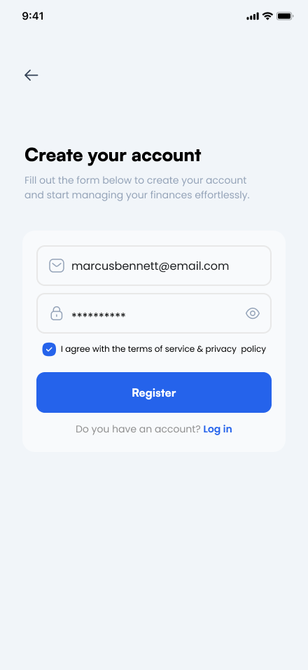
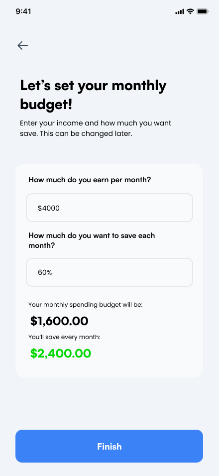
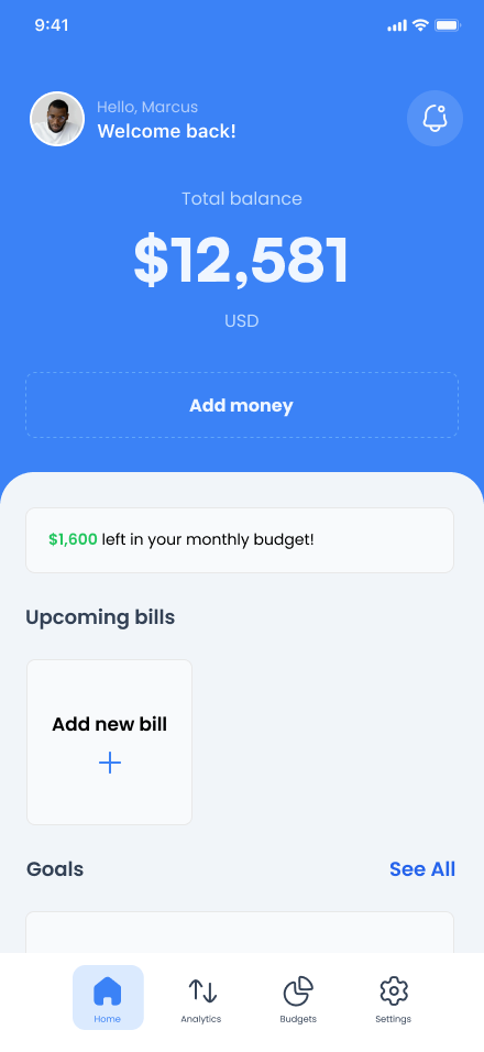
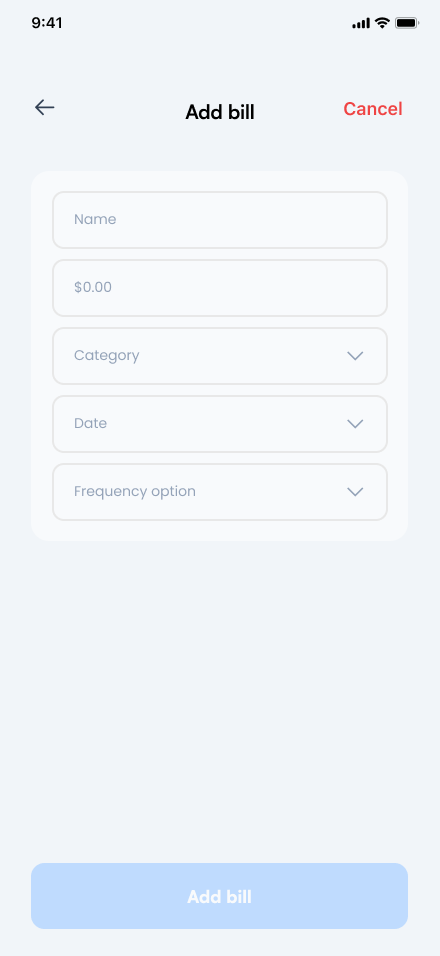
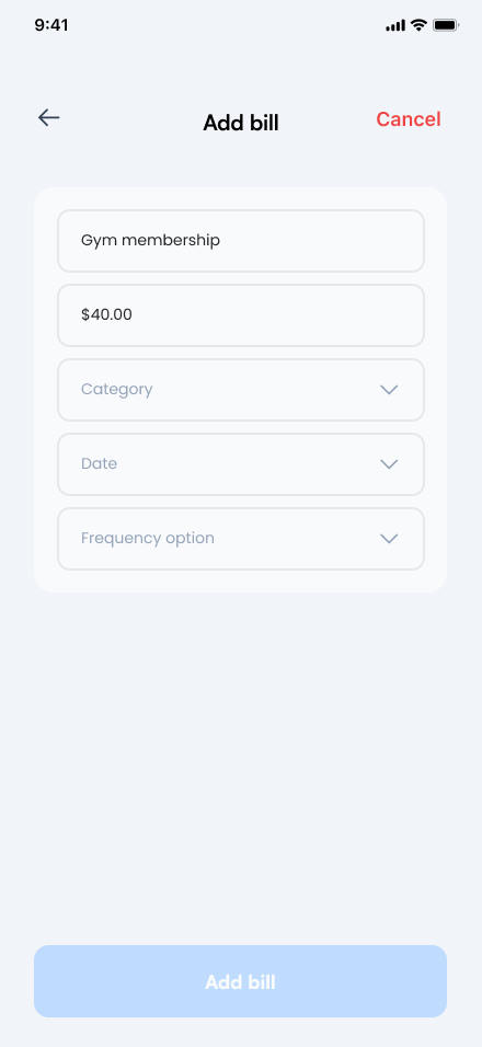
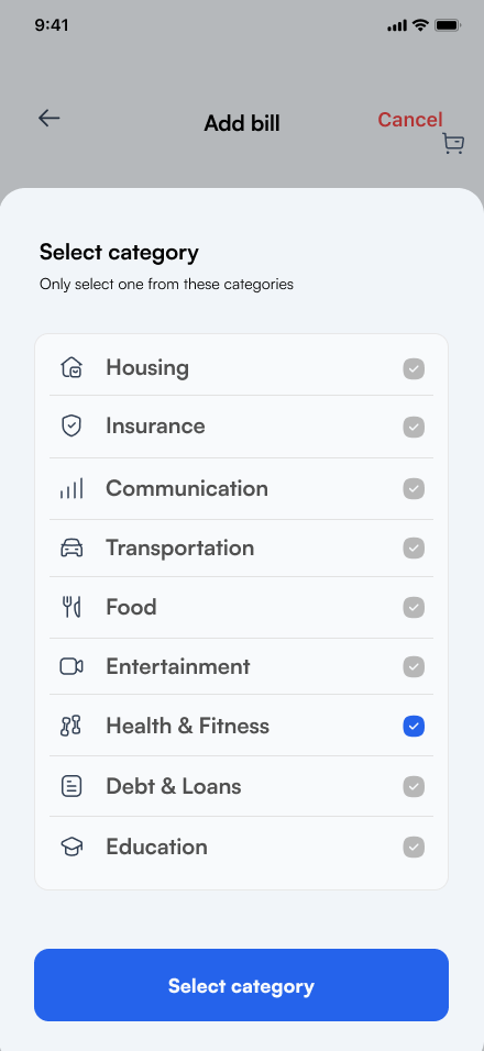
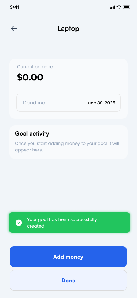
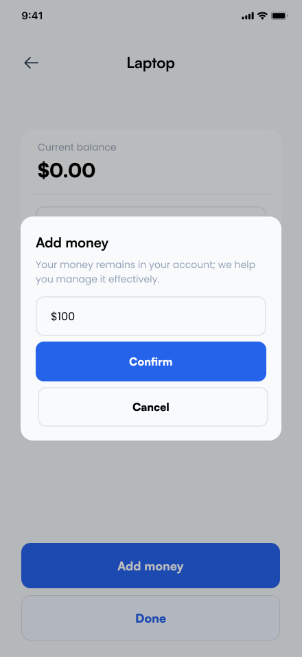
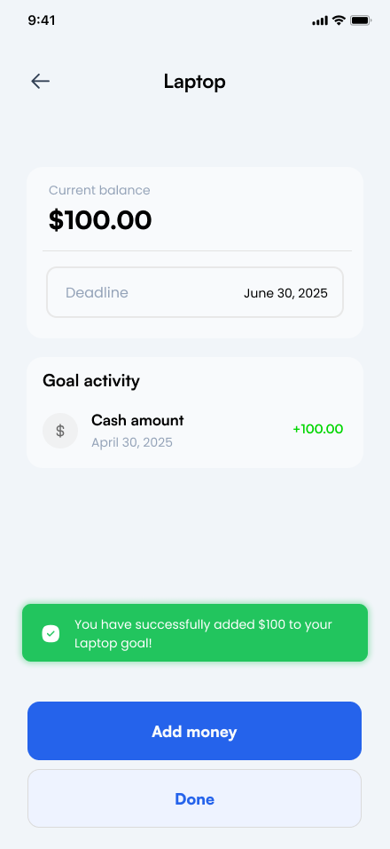
With the core flows mapped, I translated them into high-fidelity screens — refining account creation, budget setup, bill entry, and savings goals into a polished, ready-to-test interface.
Approachable by design
The high-fidelity goal was making financial management feel welcoming rather than intimidating.
I built a consistent visual system with straightforward navigation and clear typography that established hierarchy without adding pressure. Accessibility was built in throughout: readable type, sufficient contrast, larger touch targets, and guided flows that reduced cognitive load.
The screens were then connected into an interactive prototype for usability testing.
Friendly blue accents, rounded surfaces, and calm spacing, intended to reduce financial anxiety.
Readable type, strong contrast, and generous touch targets for inclusive mobile use.
Small changes, big impact
I ran unmoderated usability testing with 12 participants in Maze across three core tasks: account creation, adding a bill, and creating a savings goal.
100% success · 0% drop-off (12 responses) Every participant completed setup, though a 38.6% misclick rate points to some friction along the way.
70% success · 30% drop-off (10 responses) The weakest task — drop-off concentrated at the bill categories step, where several participants cycled between the form and dashboard without finishing.
88.9% success · 11.1% drop-off (9 responses) Most participants completed the task, but several bounced between the dashboard and Savings screen before finding it.
Test sessions showed participants bouncing between the dashboard and the Savings screen before completing the goal-setting task — a sign the label didn't match how they thought about the feature. Renaming it to "Goals" was intended to make the purpose instantly clearer.
Adding a bill had the lowest success rate of the three tasks and the highest misclick rate, with participants repeatedly cycling through the categories step without finishing. More prominent "+ Add Bill" / "+ Add Goal" entry points and more descriptive form fields were designed to address that friction directly.
Small changes, but ones intended to meaningfully improve discoverability.
Room to grow
Sprout was designed to reduce everyday budgeting friction and build trust as a supportive alternative to rigid financial tools.
Designed to reduce friction so users feel supported sticking with a budget, rather than abandoning it.
A supportive tone and clear interface, intended to position Sprout as an approachable alternative to rigid financial tools.
Room to grow into automated reminders, personalized insights, and smart recommendations.
Sprout reinforced that designing a financial product isn't just about displaying numbers clearly — it's about understanding how those numbers make people feel.
Small decisions, like renaming "Savings" to "Goals" or surfacing a clearer "Add Bill" action, were intended to make the experience feel more intuitive and encouraging — turning something people often avoid into something that feels manageable.