BeavsHub,course planning made clear.
Redesigning a student-built course planning tool for OSU's digital standards - so students can confidently plan their academic paths.
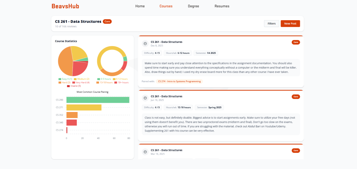 After
After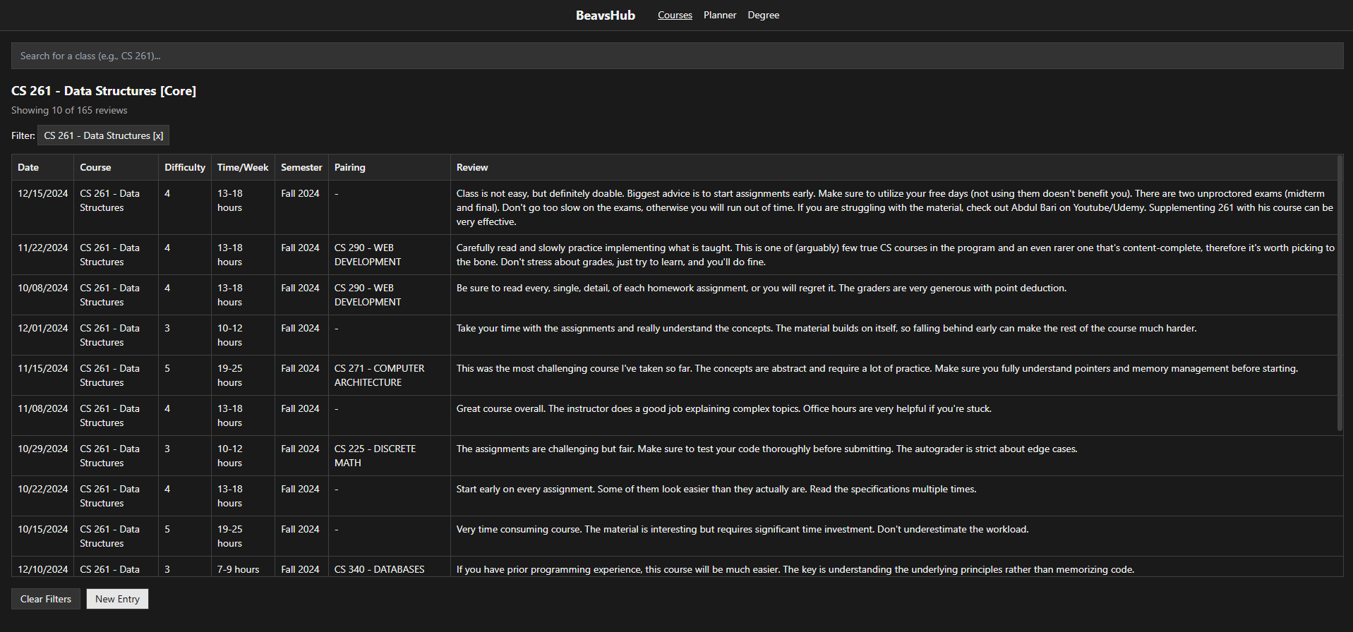 Before
Paul Nguyen, a current OSU CS student and BeavsHub's original creator, asked me to help transform the platform into a more intuitive, reliable tool students could confidently use to plan their academic paths.
BeavsHub lacked structure, visual consistency, and alignment with OSU's digital standards - making it hard for students to trust or navigate.
I redesigned the interface for clarity and navigation, applied OSU's visual brand consistently, added degree-progress and prerequisite-planning tools, and validated the design through usability testing with OSU CS students.
Grounded in three inputs
I started by understanding the creator's priorities, how students actually plan, and what competitors were missing.
Paul set the initial priorities: better structure, clearer reviews, and planning tools.
Five OSU CS students revealed they care more about course difficulty and workload than professor ratings.
Tools like Rate My Professors and Class Central showed the opportunity was combining peer insights with degree planning.
Paul Nguyen, the OSU CS student who created BeavsHub, approached me with a clear goal: improve the site's usability and visual structure so students could actually rely on it. While the original platform had potential, it lacked clarity and didn't guide users through planning effectively. This conversation gave me key priorities - better structure, clearer reviews, and planning tools - which I used to define the redesign direction.
I spoke with five OSU CS students to understand their current planning process. Most used a mix of unofficial tools and struggled to find reliable course info in one place. A key insight was that students care less about professor ratings and more about course difficulty, workload, and how classes pair together. This shaped how I approached features like structured reviews, course comparison, and visual planning tools.
"I built BeavsHub because I wanted one place where CS students could actually plan their classes without jumping between five different sites."
"I just want to know how hard the class is, how much time it takes, and what it pairs well with - professor reviews don't always tell me that."
"Planning out my degree feels like solving a puzzle with missing pieces. I wish I could just see what I've done and what's left all in one place."
From research to structure
I synthesized the interviews into personas, then used card sorting to turn behavior into an information architecture.
Ethan
"I just want to know which classes are beginner-friendly and won't overwhelm me."
- Wants clear course recommendations for his degree track, and doesn't understand how courses connect to each other.
- Frustrated by vague course descriptions and research scattered across Reddit and Rate My Professors.
- Needs a difficulty rating system and a visual map of prerequisites.
Rachel
"I need to know how much time each class takes so I don't overload myself while working."
- Needs real weekly workload estimates to plan around her job.
- Struggles to compare electives side-by-side for relevance to her career goals.
- Wants a "low workload" filter for semesters she needs to balance work.
I ran 9 card-sorting sessions with 18 cards across 4 categories to test how students naturally grouped planning features. The clear signal: students value accuracy, simplicity, and fast access over polish.
Thinking in actions, not menus
The sitemap and wireframes were organized around what students actually want to do.
Using those insights, I built a sitemap around how students actually think - in actions like plan, compare, and register, not categories or menus.
From there, low-fidelity wireframes mapped out core flows like course summaries and prerequisite planning, prioritizing scannability over density.
Build a degree path with clear prerequisites and progress.
Evaluate courses by difficulty, workload, and peer feedback.
Move from planning to enrollment with confidence.
Low-friction flows, high-fidelity details
I optimized the review flow for speed and refined the interface to guide decisions without overwhelming.
The original review form asked for open-ended written feedback with no structure. I redesigned it around specific prompts - difficulty rating, weekly workload, and course pairing - so students could contribute a useful review in under a minute, without needing to write an essay.
This flow shaped the high-fidelity wireframes, where details like review prompts and visual prerequisite indicators were refined to guide decisions without overwhelming the page.
I was the sole designer on an already-live product with no design system. I built and documented new patterns as I introduced them, while real students used the tool throughout.
Validated with students
Usability testing turned one standout insight into a core feature.
I usability-tested the high-fidelity prototype with 5 OSU CS students on three core tasks:
Find key details like course difficulty, workload, and general course information.
Understand what's required and how a course fits into the academic path.
Navigate the review flow and leave structured feedback.
90% of participants completed the core tasks without mistakes, validating that the redesigned navigation and content hierarchy held up under real use.
Students wanted a visual way to track completed courses.
Beyond the core tasks, participants repeatedly brought up wanting to see which classes they'd already completed and what to take next. That feedback led me to collaborate with Paul on a visual course roadmap - letting students mark completed courses and see their academic progress at a glance.
The redesign strengthened BeavsHub as a trusted academic planning resource for OSU students.
A Clearer Path to Degree Progress
Usability testing with 5 OSU CS students surfaced one standout need: a visual way to track completed courses. That finding shaped the progress-tracking feature I designed with Paul, giving students a clearer sense of where they stand in their degree.
Design Decisions Grounded in Real Behavior
Nine card-sorting sessions across 18 cards showed students prioritize accuracy, simplicity, and fast access over visual polish - insight that directly shaped the navigation and content hierarchy, replacing what would otherwise have been assumption-based design choices.
Closing a Gap Existing Tools Missed
Competitive analysis found that tools like Rate My Professors and Class Central each solved half the problem - peer insight or degree planning, not both. The redesign brings both into a single, prerequisite-aware interface.
A First Step Toward Trust
Usability testing across core tasks - course info, prerequisites, and reviews - showed students could complete the actions they came to do, a first step toward BeavsHub becoming a tool they trust.
This project was a deep dive into how students make academic decisions.
Grounding every choice in real feedback and iterating closely with Paul reinforced how much clarity and trust matter in tools people rely on for something as important as their degree.
Check out BeavsHub live→Since this case study, the developer has continued to make updates to the live site - so what you see today may differ from these designs.